


#30 1B
Search results
Minnesota Twins
Other games
Twins @ Diamondbacks
Jun 27, 3:40 PMMoney LineSpreadTotalMIN -105+1.5O9.5ARI-115-1.5U9.5
Bet now on
Central W L PCT GB L10  Cleveland
51 27 .654 0.0 7-3  Minnesota
44 36 .550 8.0 6-4  Kansas City
44 38 .537 9.0 3-7  Detroit
37 43 .463 15.0 3-7  Chi White Sox
21 61 .256 32.0 2-8 East W L PCT GB L10  NY Yankees
52 30 .634 0.0 2-8  Baltimore
50 30 .625 1.0 4-6  Boston
43 37 .538 8.0 7-2  Tampa Bay
40 41 .494 11.5 7-3  Toronto
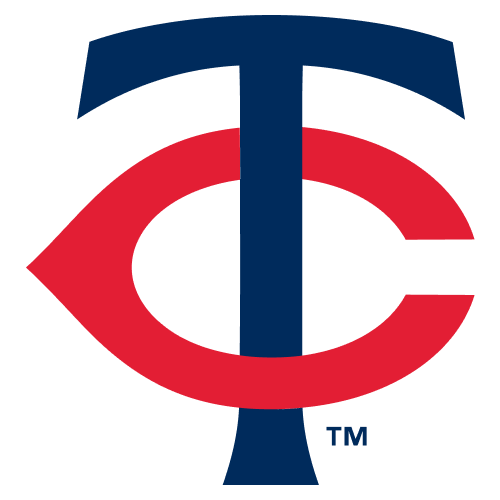
36 43 .456 14.5 2-7 The Minnesota Twins have an interlocking "TC" logo despite the letter "C" not appearing anywhere in the name. Why is that? The short answer is that the "TC" stands for "Twin Cities" -- signifying, of course, the Minneapolis-St. Paul metropolitan area.
Minnesota Twins Logo on Chris Creamer's Sports Logos Page - SportsLogos.Net. A virtual museum of sports logos, uniforms and historical items.
Sep 27, 2022 · What is the Minnesota Twins Logo? The Minnesota Twins modernized their long-used logo for the 2010 season. The main idea of the logo remained, Twins scripted in red with an underscore highlighting the word WIN on a baseball, a new silver drop shadow added to the wordmark.
Nov 18, 2022 · Towards the end of the season, the Minnesota Twins announced that the club was undergoing a rebrand. Today, they unveiled their new logos and uniforms that they’ll sport moving forward,...
Minnesota Twins logos throughout history.
Aug 3, 2023 · Minnesota Twins logo explained. Starting with the 2023 season, the Minnesota Twins introduced a new logo and color scheme, the first major change the team made in decades. The classic...
People also ask
Why do the Minnesota Twins have a TC logo?
What did the Twins logo look like in 2010?
Where can you find the Minnesota Twins logo?
Did the Minnesota Twins change their logo before the 2023 season?
Why do the Minnesota Twins have a 'M' & 'W'?
Why did the twins rebrand the TC cap logo?
Jan 8, 2024 · In the realm of curveballs and home runs, the Minnesota Twins logo stands steadfast—it’s more than mere embroidery on a cap or stitched emblem on a jersey. It’s a legacy interwoven with the fabric of Minneapolis-St. Paul, a testament to the indomitable spirit that graces the diamond at Target Field.


