Search results
Barcelona
Other games
La Liga FT May 19 vs 
Rayo Vallecano W3 - 0Recap Rank GP W D L Pts 1  Real Madrid
38 29 8 1 95 2  Barcelona
38 26 7 5 85 3  Girona
38 25 6 7 81 4  Atlético de Madrid
38 24 4 10 76 5  Athletic Club
38 19 11 8 68 6  Real Sociedad
38 16 12 10 60 7  Real Betis
38 14 15 9 57 8  Villarreal
38 14 11 13 53 9  Valencia CF
38 13 10 15 49 10  Alavés
38 12 10 16 46 11  Osasuna
38 12 9 17 45 12  Getafe
38 10 13 15 43 13  Celta de Vigo
38 10 11 17 41 14  Sevilla
38 10 11 17 41 15  Mallorca
38 8 16 14 40 16  Las Palmas
38 10 10 18 40 17  Rayo Vallecano
38 8 14 16 38 18  Cadiz
Cadiz38 6 15 17 33 19  Almería
38 3 12 23 21 20  Granada CF
38 4 9 25 21 Learn about the history and meaning of the Barça crest, which dates from 1910 and represents Catalonia and the Club's colours and style. See the evolution of the crest design and the trophies won by the team.
- Our colours | FC Barcelona Official Channel
The colours have always been used on the team kit,...
- FC Barcelona creates new visual identity to commemorate 125th ...
Club. 01 Dec 23. FC Barcelona has just celebrated its 124th...
- Our colours | FC Barcelona Official Channel
Futbol Club Barcelona ( Catalan pronunciation: [fubˈbɔl ˈklub bəɾsəˈlonə] ⓘ ), commonly known as Barcelona and familiarly as Barça ( [ˈbaɾsə] ), is a professional football club based in Barcelona, Catalonia, Spain, that competes in La Liga, the top flight of Spanish football . Founded in 1899 by a group of Swiss, Catalan, German ...
- 1899 – 1910
- 1910 – 1920
- 1920 – 1936
- 1941 – 1949
- 1949 – 1960
- 1960 – 1974
- 1975 – 2002
- 2002 – Today
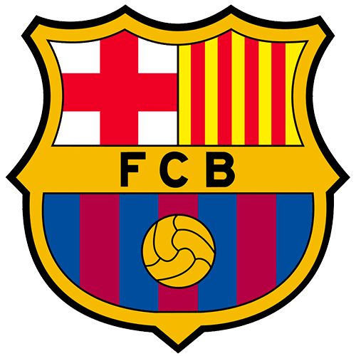
The debut symbolism is centered around a golden diamond positioned between two branches – laurel and palm. The central element is divided into four parts, two of which depict the Catalan flag (red stripes on a yellow field) and two – a broad crimson cross on a white background. Above the geometric figure is a crown with precious stones – embodying ...
In 1910, the final logo of the “Barcelona” team, which is still relevant today, appeared. Subsequent changes (and there were several) did not affect its essence: minor adjustments concerned only small details. In particular, changes touched the style, outline, and arrangement of letters. But heraldic elements were precisely preserved: a large figur...
Ten years later, designers intensified the palette of key details, making the background of the letters and ball vividly yellow. They also worked on the ornament on the shield’s border and replaced complex elements with six strict lines – three on each side.
The logo of this period has much in common with the modern version, except for the thickening at the bottom and the intensity of the color.
After the redesign, the emblem received a brown ball, a white background for the name, and an abbreviation supplemented with the Spanish preposition “de.”
The logo of the 60s was squat. It was dominated by red shades, which replaced the brown ones. Another change concerned the return of the yellow color.
A year later, the emblem gained brightness and clarity. The existing palette was enhanced, letters were highlighted in bold font, and the ball’s color was changed.
With the advent of the millennium, the club decided to modernize the emblem. The work was entrusted to designer Claret Serrahima, who removed the dots from the team’s abbreviated name, reduced the second half of the shield, and left one tooth at the bottom instead of three. He also removed the extra decorations from the outer edge.
Jan 21, 2023 · Logo Redesign Competition: After a crisis in 1908, a competition led by Joan Gamper, the club’s founder, resulted in a new logo designed by Carles Comamala, who was a medical student, amateur artist, and Barcelona player. This logo has been tweaked slightly over the years but retains its original elements .
Learn about the evolution and symbolism of the FC Barcelona logo, one of the most iconic crests in football. Discover the origins of the red cross, the Catalan flag, the blue and red stripes, and the soccer ball.
Oct 14, 2023 · The history of FC Barcelona's logo is a captivating journey through time and design, reflecting the club's rich legacy. From its humble beginnings to the ico...
People also ask
What does the Barcelona logo stand for?
Who founded the Football Club Barcelona?
What does the Barcelona FC logo look like?
Which UEFA Team is based in Barcelona?


Related searches
Searches related to barcelona team logo
fc barcelona team logo real madrid team barcelona team players barcelona team coach barcelona team pic barcelona team names chelsea team


