


#26 RF
Search results
Minnesota Twins
Other games
Twins @ Guardians
May 18, 6:10 PMMoney LineSpreadTotalMIN -120-1.5O7.5CLE+100+1.5U7.5
Bet now on
Central W L PCT GB L10  Cleveland
28 17 .622 0.0 5-5  Kansas City
27 19 .587 1.5 6-4  Minnesota
24 20 .545 3.5 4-6  Detroit
22 22 .500 5.5 4-6  Chi White Sox
14 31 .311 14.0 6-4 East W L PCT GB L10  NY Yankees
31 15 .674 0.0 8-2  Baltimore
28 14 .667 1.0 7-3  Tampa Bay
24 22 .522 7.0 6-4  Boston
22 23 .489 8.5 3-7  Toronto
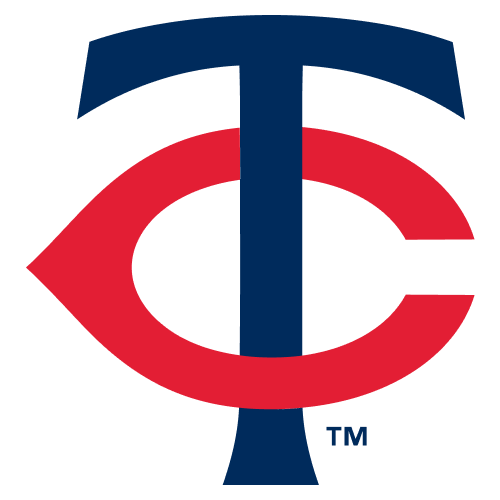
19 24 .442 10.5 4-6 The Minnesota Twins have an interlocking "TC" logo despite the letter "C" not appearing anywhere in the name. Why is that? The short answer is that the "TC" stands for "Twin Cities" -- signifying, of course, the Minneapolis-St. Paul metropolitan area.
Jan 8, 2024 · Central to the logo is the hypnotic “TC,” flanked by a baseball signifying the game at its core. Embracing it all is the wordmark “Minnesota Twins,” a bold declaration of identity. Together, these elements are a synergy of pride and professional baseball team crests.
Aug 3, 2023 · — Joon Lee (@joonlee) November 18, 2022. The Twins still wear their iconic 'TC' logo on a regular basis, but the cursive 'M' seems to be gone forever. Perhaps it will make a special appearance...
Feb 22, 2024 · Explore the captivating evolution of the Minnesota Twins logo, from its humble beginnings to its iconic status in the world of sports. Join us as we uncover its secrets and delve into the rich...
- 5 min
- 30
- Sports History Group
- Meaning and History
- Font and Colors
- FAQ
The “Minnesota Twins” had a huge number of logos at different times. Starting as “Washington Senators,” the club changed its name several times. Moreover, the debut logo is radically different from today’s. In the early versions, the predominant letter was “W” – from the name of the state of Washington. Now, a form of seal with a diagonal inscripti...
Before the appearance of the modern version, there was a logo that directly reflected the essence of the club’s name. It depicts two athletes, one in the “Minneapolis Millers” uniform, the other – “St. Paul Saints.” They shake hands on opposite banks of the Mississippi River. A baseball and an administrative map of the state of Minnesota are used a...
What does the “Minnesota Twins” TC logo mean? The alternative Minnesota Twins logo with the TC monogram denotes twin cities – Minneapolis and St. Paul. The fact is that the team is based in Minneapolis but plays for both cities. The intertwined T and C badges adorn the baseball caps. What was the “Minnesota Twins” team called before? In the past, t...
- 1901
- Minneapolis, Minnesota, U.S.
- Pohlad family
- mlb.com
People also ask
What does the Minnesota Twins logo mean?
What does TC mean on the Minnesota Twins logo?
What does the 1987 Minnesota Twins logo look like?
When did the Minnesota Twins logo change?
Minnesota Twins Logo on Chris Creamer's Sports Logos Page - SportsLogos.Net. A virtual museum of sports logos, uniforms and historical items. Currently over 10,000 on display for your viewing pleasure.
The iconic emblem of the Minnesota Twins, a baseball team with its home base in Minneapolis, has a bright red letter "C" entwined with a dark blue letter "T." Fans and baseball enthusiasts everywhere recognize this logo, which has come to represent the team.


